Design
Corporate Identity
Define Yourself
Identity has to do with branding; defining yourself with a visual tag to help your target audience understand and remember you in an often crowded field.
Your “brand” arises out of your company culture, the quality of your product or service, even the way you communicate with your clients. The logo often emphasizes one aspect of your identity in a memorable way. QR Creative has over 20 years of experience working with clients in this field.
Case Studies
![]()
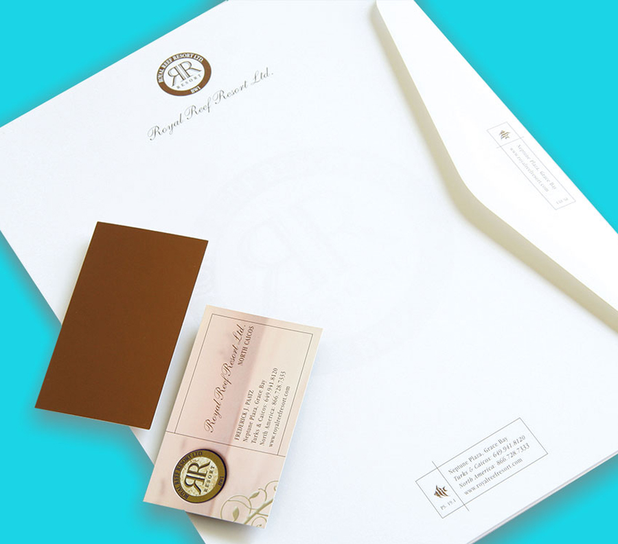
Estates International Royal Reef Resort
PROJECT:
Embellish existing logo type, create upscale stationery package for Turks & Caicos Resort. (A promotional mulipocket folder package and corporate advertising was also created giving the RRR a distinctive identity.)
CLIENT:
Estates International
Royal Reef Resort Ltd.
I would like to express my delight in working with QR Imaging, Ted Blenkhorne and his professional staff. It is extremely rare to find a company who successfully strives and achieves customer satisfaction the way we have experienced with QR Creative.
As a $160 Million resort development we dealt with many facets of print, brand development and design in which QR Creative has been an integral part. Not only have they delivered a breathtaking product time and again but they have dealt with miniscule deadlines and produced every time!
Frederick J. Paatz, CEO
![]()
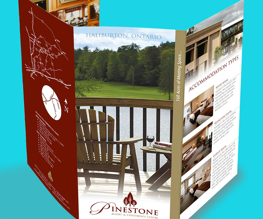
Pinestone Resort
PROJECT:
Design identity and brochure
CLIENT:
Pinestone Resort
Rich jewel tones and organic shapes evoke the restful nature of the resort. Printed on a silk paper with metallic gold the effect was to convey a refined sense of elegance and luxury.
![]()
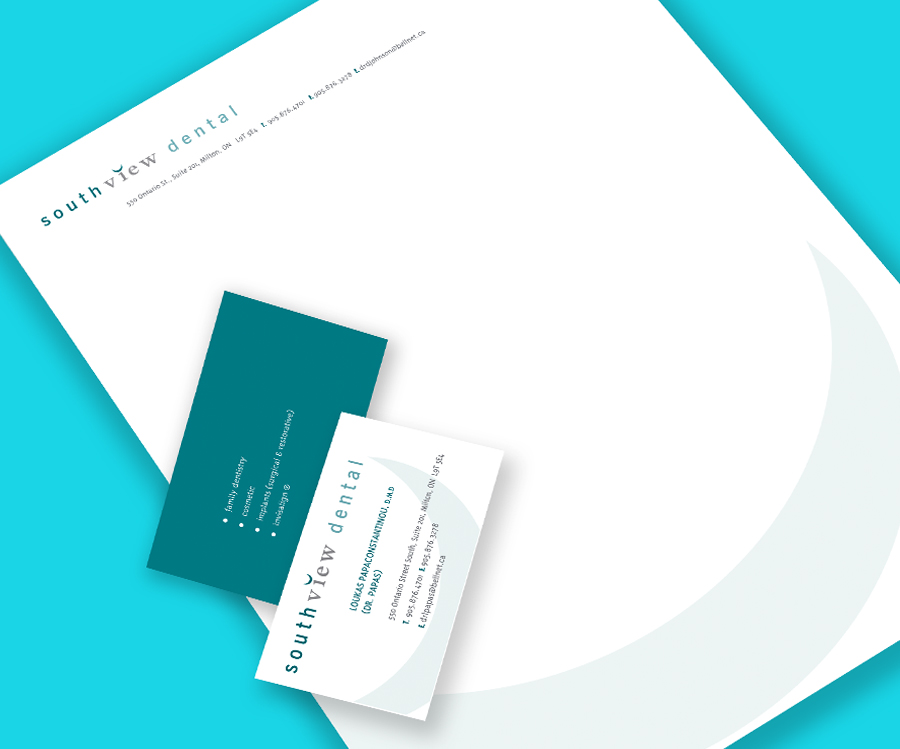
Southview Dental
PROJECT:
Design identity and stationery
CLIENT:
Southview Dental
From letterhead to appointment cards, all display the concept of a beautiful smile which is, after all, the end benefit.
![]()
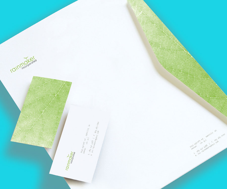
Rainmaker Incorporated
PROJECT:
Design identity and stationery
CLIENT:
Rainmaker Incorporated
Depicting growth in business. Rainmaker specialized in “making things happen” for new ventures.

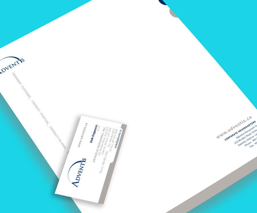
![]()
Adventis Nuclear Staffing Solutions
PROJECT:
Design corporate package and stationery, brochure.
CLIENT:
Adventis Nuclear Staffing Solutions
Adventis is a premier search and staffing firm that delivers the industry’s best recruitment solutions within Canada and globally. Stationery, corporate folder all incorporate ‘file folder’ motif symbolic of the extensive files of personnel solutions.
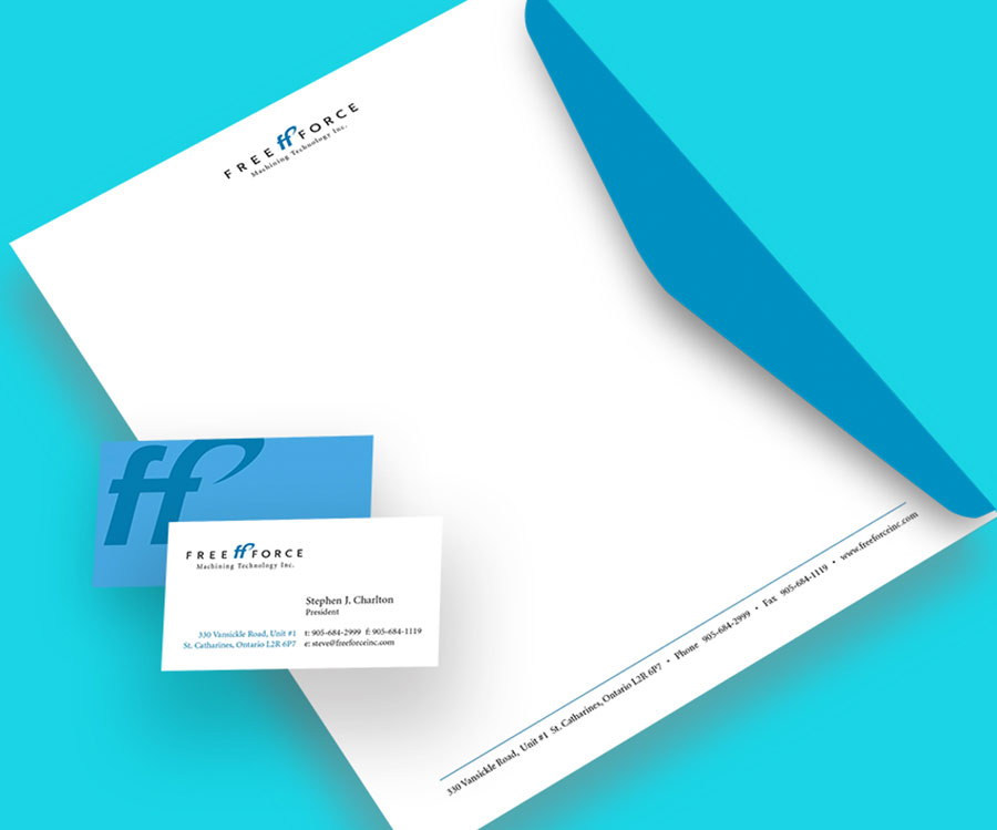
![]()
FreeForce Machining Technology
PROJECT:
Design identity and stationery
CLIENT:
FreeForce Machining Technology
Clean, strong lines and ‘industrial’ blue highlight the excellence of specialists in CNC machining of ultra-precision parts to a wide range of sectors, including today’s high technology industries. Utilizing cutting edge technology in both machining and CAD/CAM software prototypes to production runs.
![]()
Halton Healthcare
PROJECT:
Design branding for the Self Management initiative for use on website and posters
CLIENT:
Halton Healthcare
The intent was to convey that programs offered under this initiative enabled people to take control by gaining confidence, skills and knowledge to thrive.

![]()
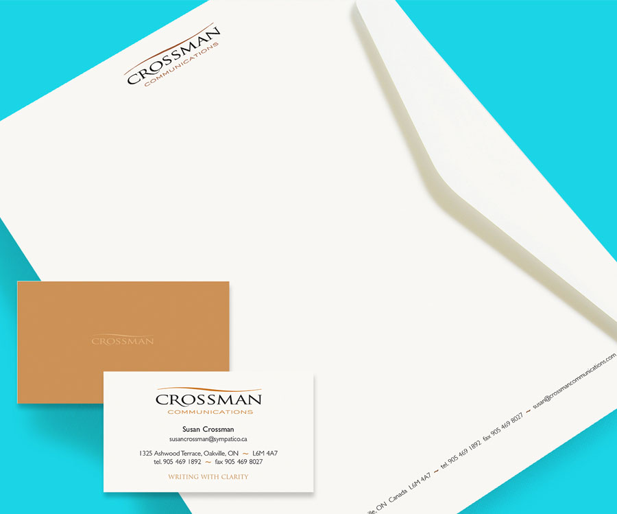
Crossman Incorporated
PROJECT:
Design identity and stationery, website update
CLIENT:
Crossman Communications
Stationery package for a local copywriter and author emphasising clarity and ease of consise communication.
![]()
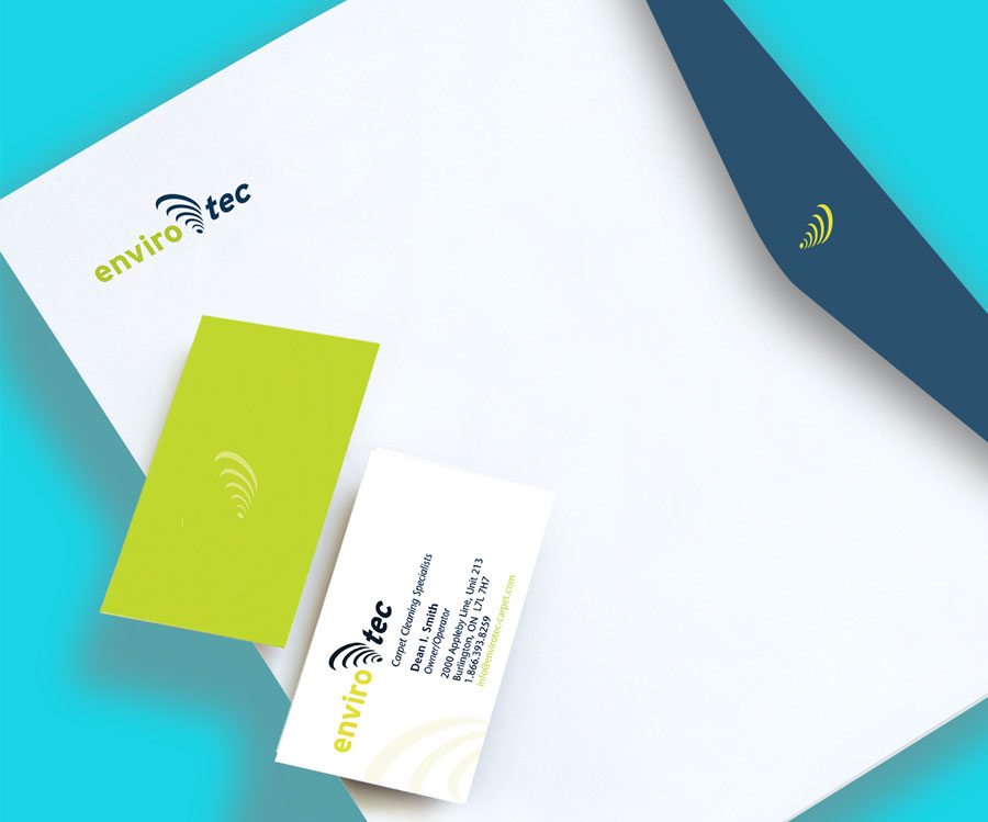
EnviroTec
PROJECT:
Design identity and stationery
CLIENT:
EnviroTec
Envirotec developed a new “cyclone-action” cleaning system which is particularly effective in removing dirt and debris from carpet.
We were especially pleased with how the logo suggested the vigorous action of this cleaning system.
![]()
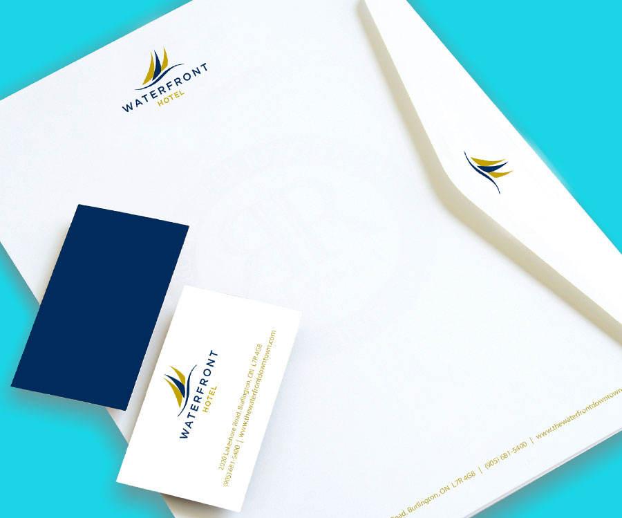
Waterfront Hotel
PROJECT:
Design identity and stationery
CLIENT:
Waterfront Hotel
The fluid movement and nautical lines of this logo speak to the beauty of the hotel’s location on the banks of Lake Ontario, while the sophisticated colour pallet position the hotel as an upscale property.
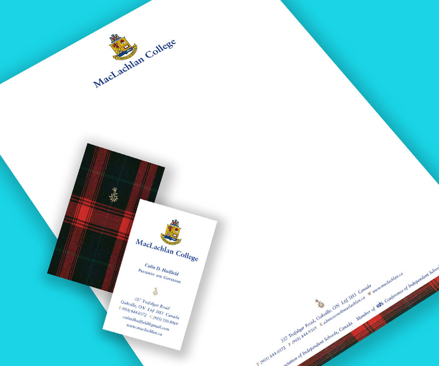
MacLachlan College
PROJECT:
Embellish existing logo type, create upscale stationery package for MacLachlan College. (A promotional brochure with custom photography, corporate folder and numerous other collateral were also created as part of the roll out of the re-brand. We decided to incorporate the actual MacLachlan tartan, part of their new uniform, which is also the actual clan tartan as part of the brand language.)
CLIENT REMARKS:
. . . We have found QR to be a highly professional group concerned with its clients’ best interests at all times. Without fail, the staff continue to impress us with their creativity and imagination in the branding and re-branding of our school.
Colin Hadfield
CEO, MacLachlan College

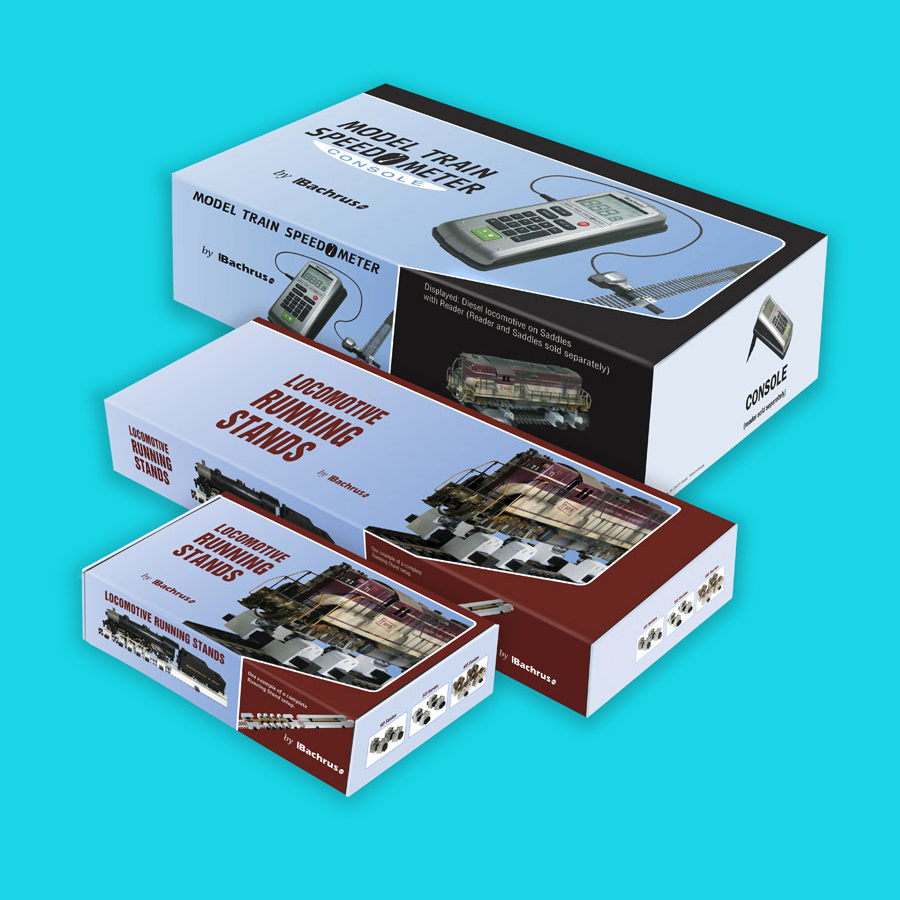
Bachrus
PROJECT:
Design product packaging
CLIENT:
Bachrus
We have worked with Bachrus for many years. We decided to display just one piece because Bachrus is a “cottage industry”. They design and manufacture items of special interest to the model railroad hobbyist. We believe their products are well-conceived, manufactured to excellent standards and innovative within the industry.
While we have provided many marketing and branding materials for Bachrus, we have chosen a major milestone development, deciding to package their products in a box rather than plastic cases. Their products are sold world-side and dealers have reported a huge benefit to their sales with the advent of their new packaging.
“Our company has been dealing with QR Imaging/Creative for some 14 years. Initially they were tasked to give our company an identity (ie: logo, etc) then apply it to our ads, web site and packaging for our product.) To their credit they took the time to understand our company, our product and the market for which it is geared. We have been, and still are, very impressed with their quality, competitive pricing and more importantly, the effectiveness of their ads. We would have no reservations in recommending QR.”
Promotion
Get Noticed
Promotion is about getting noticed by all the “right people”, that is, by the target market. Successful promotion establishes a presence beyond the noise and clutter, a presence which motivates the consumer to act.
Our promotional work includes:
- Advertisements
- Packaging
- Brochures
- Posters
- Catalogues
- Price Lists
- Coupons
- Sell Sheets
- Newsletters
- Window Clings
Case Studies

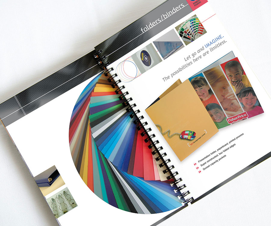
HTX Group
PROJECT:
Product brochure catalogue package
CLIENT:
HTX Group
As the client products include innovative binders, boxes, kits and packaging, we created a wire-o bound brochure catalogue showcasing their range of colourful products.
![]()
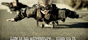
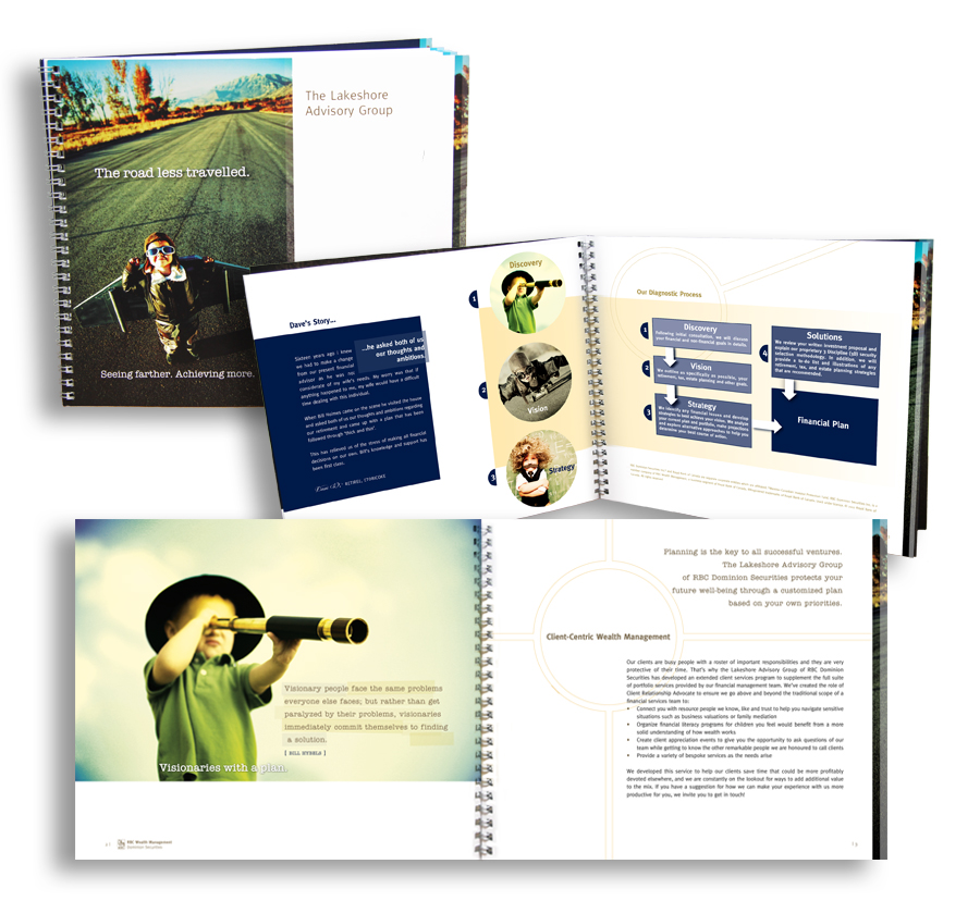
RBC Wealth Management, Dominion Securities, The Lakeshore Advisory Group
PROJECT:
Brochure ‘The Road Less Travelled.
Seeing farther. Achieving more.’
CLIENT:
RBC Wealth Management,
Dominion Securities
The Lakeshore Advisory Group
The title borrows from the historic Robert Frost poem encouraging investors that planning ‘makes all the difference’.
Continuing the theme, the brochure employs famous quotes illustrating key strategies as well as admonishment slogans such as ‘Life is an adventure… plan on it’ and ‘Go beyond speculation’ highlighting LAG’s investment philosophy.
The text is layered with children in future endeavours thus speaking to the purpose of building generational wealth.
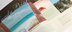
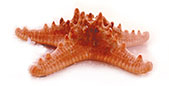
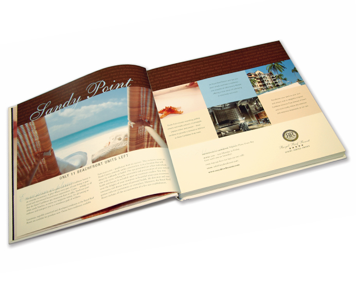
Estates International Royal Reef Resort
PROJECT:
Sandy Point Advertisement
Turks & Caicos Tourism Book
CLIENT:
Estates International
Royal Reef Resort Ltd.
Promoting beachfront condos at the Royal Reef Resort and Spa. The pink starfish became symbolic of the resorts placid setting.

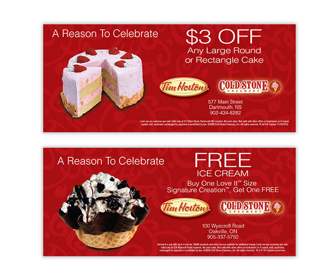
Cold Stone Creamery
PROJECT:
Design coupons/vouchers for Cold Stone Creamery
CLIENT:
Cold Stone Creamery
Although Cold Stone is no longer with Tim Hortons in Canada we enjoyed numerous projects including brochures, posters, window clings, marketing summit materials. trade banners and signage.
Who wouldn’t enjoy working with such tasty imagery.

![]()
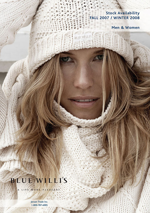
Silkeborg
PROJECT:
Design and layout Blue Willi’s
Fall \ Winter catalogue
CLIENT:
Silkeborg
(fashion retailer)
To showcase Denmark’s high-end clothing line available in their downtown boutique and on-line.

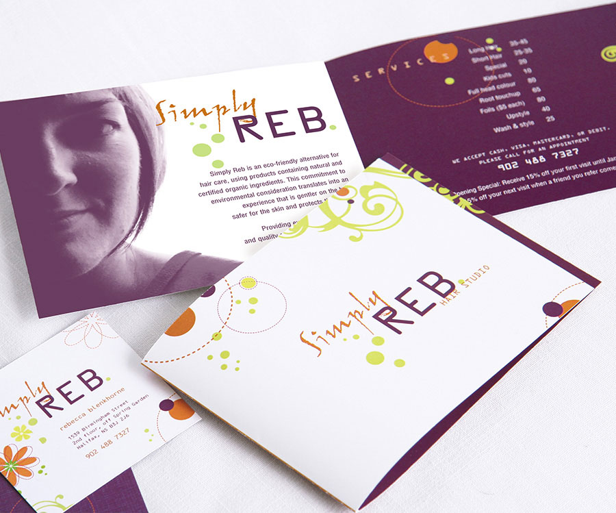
Simply Reb Hair Studio
PROJECT:
Identity, business cards and salon sevices brochure
CLIENT:
Simply Reb Hair Studio
A touch of whimsy and flair to emulate the eco-friendly hair salon in Halifax.


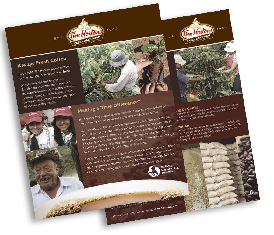
Tim Hortons
PROJECT:
Making a True Difference poster
CLIENT:
Tim Hortons
Numerous other projects for Tim Hortons include local advertising, brochures, newsletters, nutrition guides, trade banners and signage.
EDUCATION | EDITORIAL
Inform others
Going beyond simply relaying facts and raw data, we endeavour to create pieces that convey the embodiment of your message, its tone and manner with visual clarity and concise language.
A representative sampling includes:
- book covers
- brochures
- curriculums
- manuals
- way finding
- magazines
- informational posters
Case Studies
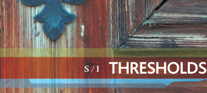

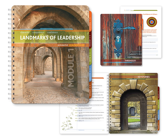
Landmarks of Leadership
PROJECT:
Landmarks of Leadership curriculum,
Module 1
CLIENT:
NextLEVEL Leadership
As the curriculumn was written for women in leadership, the concept was based on the theory that women are visual learners. With that in mind, dynamic images were utilized to symbolize key “landmarks” of leadership. The curriculum was produced internationally in offset and on-line versions.

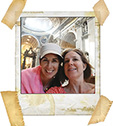
Rome
PROJECT:
Rome 33 Hours: The Fast Track Tour e-book
CLIENT:
Greer Hutchison
This playful e-book magazine depicts editorial spreads showcasing the splendor of the eternal city fused with quirky humour.

Mining
PROJECT:
Canadian Mining Industry e-Report
CLIENT:
Bedford Consulting Group
This 72 page document which included numerous charts, all created from raw data was designed and adapted for electronic distribution with hot buttons and links.
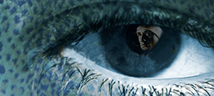
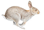
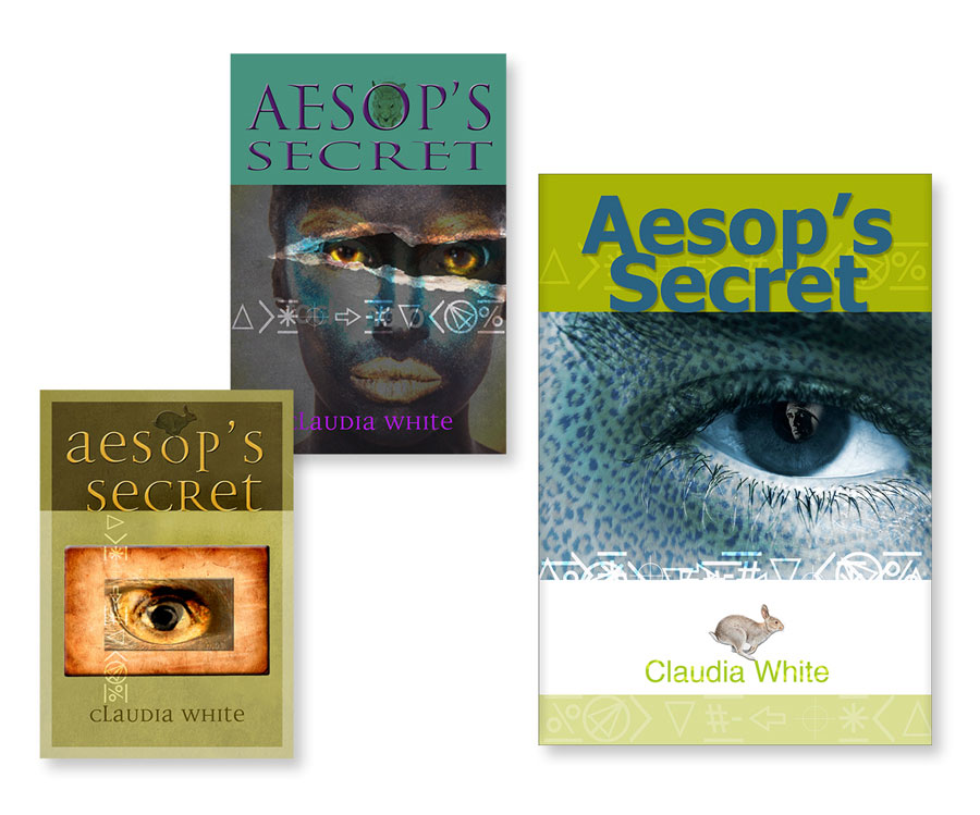
Aesop’s Secret
PROJECT:
Aesop’s Secret
e-book cover and composites
CLIENT:
Claudia White
Before we begin a project we get to know the product in order to effectively depict the message. The teen fantasy novel is about a secret race of shapeshifters who discover their special abilities as they come of age. Special attention was given to eye imagery based on the fact that in the story, the shapeshifters can recognize each other in their eyes. The character of Aesop is a shapeshifter trapped in the form of a rabbit.
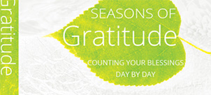

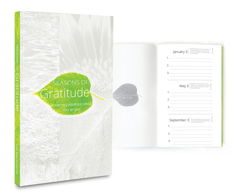
Seasons of Gratitude
PROJECT:
Seasons of Gratitude devotional
calendar perfect bound book
CLIENT:
Ted Blenkhorne
“Lest we forget…” The concept here was to make notes of prayer requests as well as items of gratitude and answered prayers with an overview of the previous three months and the previous six months that we might be truly grateful.
That is to say, we often forget the things we were especially grateful for in previous months. This little perfect bound book, available for the asking, serves to provide a written record of our journey to a happier, healthier outlook on life.


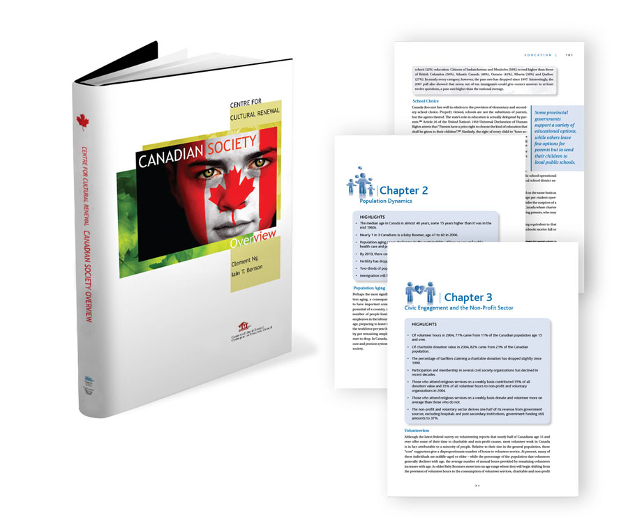
Canadian Society
PROJECT:
Canadian Society Overview Book
CLIENT:
Centre for Cultural Renewal
The intense imagery of the child’s stare garbed in the national flag depicts the seriousness of the societal wake-up call regarding the next generation, the message of the book, layered with fresh green maple leaves, the hope of a responsible response.