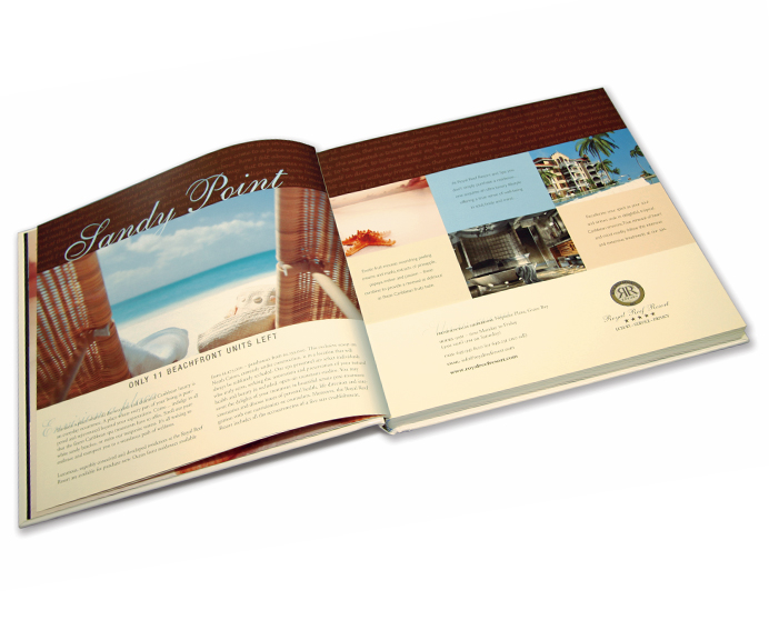
Estates International Royal Reef Resort
Estates International Royal Reef Resort
PROJECT:
Sandy Point Advertisement
Turks & Caicos Tourism Book
CLIENT:
Estates International
Royal Reef Resort Ltd.
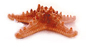
Promoting beachfront condos at the Royal Reef Resort and Spa. The pink starfish became symbolic of the resorts placid setting.
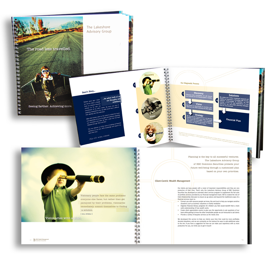
RBC Wealth Management, Dominion Securities, The Lakeshore Advisory Group
![]()
RBC Wealth Management, Dominion Securities, The Lakeshore Advisory Group
PROJECT:
Brochure ‘The Road Less Travelled.
Seeing farther. Achieving more.’
CLIENT:
RBC Wealth Management,
Dominion Securities
The Lakeshore Advisory Group
The title borrows from the historic Robert Frost poem encouraging investors that planning ‘makes all the difference’.
Continuing the theme, the brochure employs famous quotes illustrating key strategies as well as admonishment slogans such as ‘Life is an adventure… plan on it’ and ‘Go beyond speculation’ highlighting LAG’s investment philosophy.
The text is layered with children in future endeavours thus speaking to the purpose of building generational wealth.
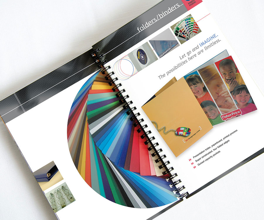
HTX Group
HTX Group
PROJECT:
Product brochure catalogue package
CLIENT:
HTX Group
As the client products include innovative binders, boxes, kits and packaging, we created a wire-o bound brochure catalogue showcasing their range of colourful products.
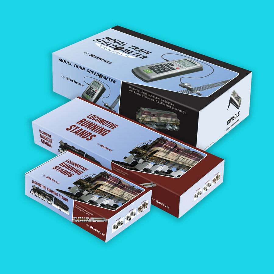
Bachrus

Bachrus
PROJECT:
Design product packaging
CLIENT:
Bachrus
We have worked with Bachrus for many years. We decided to display just one piece because Bachrus is a “cottage industry”. They design and manufacture items of special interest to the model railroad hobbyist. We believe their products are well-conceived, manufactured to excellent standards and innovative within the industry.
While we have provided many marketing and branding materials for Bachrus, we have chosen a major milestone development, deciding to package their products in a box rather than plastic cases. Their products are sold world-side and dealers have reported a huge benefit to their sales with the advent of their new packaging.
“Our company has been dealing with QR Imaging/Creative for some 14 years. Initially they were tasked to give our company an identity (ie: logo, etc) then apply it to our ads, web site and packaging for our product.) To their credit they took the time to understand our company, our product and the market for which it is geared. We have been, and still are, very impressed with their quality, competitive pricing and more importantly, the effectiveness of their ads. We would have no reservations in recommending QR.”
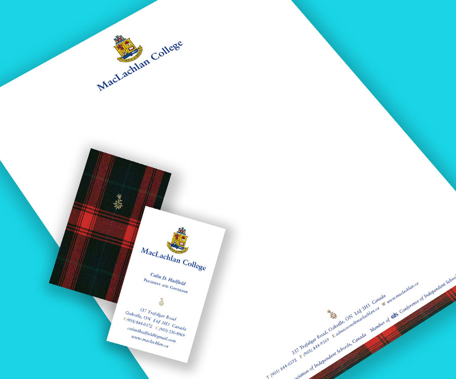
MacLachlan College

MacLachlan College
PROJECT:
Embellish existing logo type, create upscale stationery package for MacLachlan College. (A promotional brochure with custom photography, corporate folder and numerous other collateral were also created as part of the roll out of the re-brand. We decided to incorporate the actual MacLachlan tartan, part of their new uniform, which is also the actual clan tartan as part of the brand language.)
CLIENT REMARKS:
. . . We have found QR to be a highly professional group concerned with its clients’ best interests at all times. Without fail, the staff continue to impress us with their creativity and imagination in the branding and re-branding of our school.
Colin Hadfield
CEO, MacLachlan College
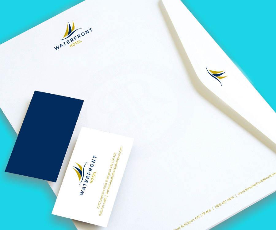
Waterfront Hotel
![]()
Waterfront Hotel
PROJECT:
Design identity and stationery
CLIENT:
Waterfront Hotel
The fluid movement and nautical lines of this logo speak to the beauty of the hotel’s location on the banks of Lake Ontario, while the sophisticated colour pallet position the hotel as an upscale property.
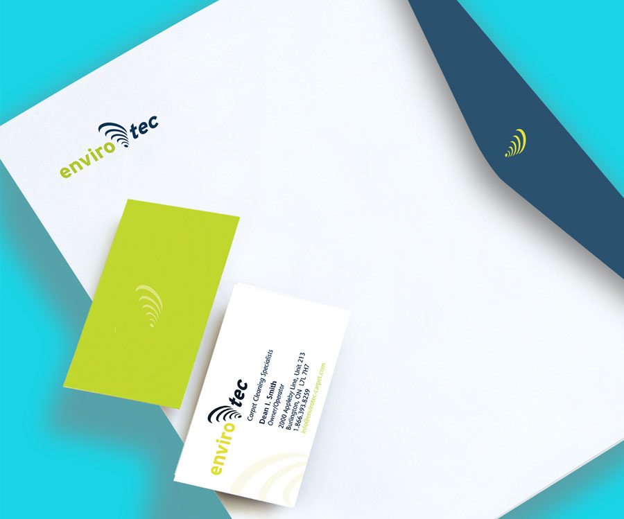
EnviroTec
![]()
EnviroTec
PROJECT:
Design identity and stationery
CLIENT:
EnviroTec
Envirotec developed a new “cyclone-action” cleaning system which is particularly effective in removing dirt and debris from carpet.
We were especially pleased with how the logo suggested the vigorous action of this cleaning system.
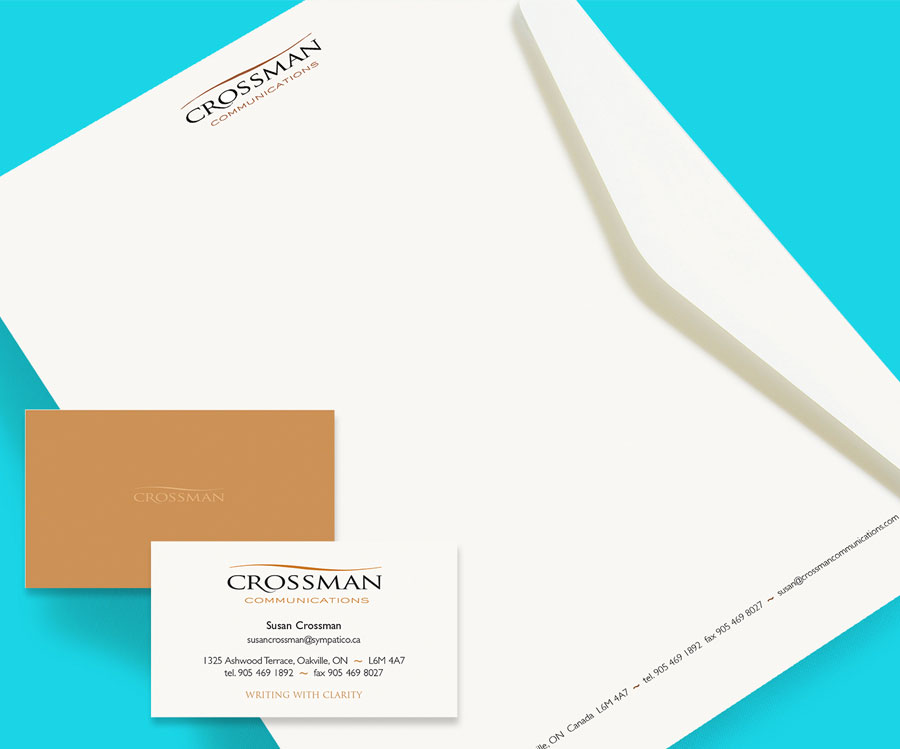
Crossman Incorporated
![]()
Crossman Incorporated
PROJECT:
Design identity and stationery, website update
CLIENT:
Crossman Communications
Stationery package for a local copywriter and author emphasising clarity and ease of consise communication.
Halton Healthcare
![]()
Halton Healthcare
PROJECT:
Design branding for the Self Management initiative for use on website and posters
CLIENT:
Halton Healthcare
The intent was to convey that programs offered under this initiative enabled people to take control by gaining confidence, skills and knowledge to thrive.

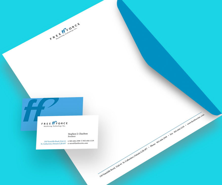
FreeForce Machining Technology
![]()
FreeForce Machining Technology
PROJECT:
Design identity and stationery
CLIENT:
FreeForce Machining Technology
Clean, strong lines and ‘industrial’ blue highlight the excellence of specialists in CNC machining of ultra-precision parts to a wide range of sectors, including today’s high technology industries. Utilizing cutting edge technology in both machining and CAD/CAM software prototypes to production runs.